How a Living Design System Helped Saba Tamin Build Financial Products Faster and Smarter

This case study explores how we built a living design system for Saba Tamin, enabling their teams to deliver consistent, scalable, and faster financial products across both B2B and B2C platforms.
About Saba Tamin
Saba Tamin is a financial technology company operating in Iran’s capital market. As a subsidiary of Shasta—one of the largest shareholders in the Iranian stock exchange—Saba Tamin offers a wide range of services, including the design and development of trading platforms, information systems, and data-driven financial products. Their solutions cater to both corporate clients (B2B) and individual users (B2C). With years of experience and multiple products in the financial domain, the company recently began a new chapter focused on rebranding and redesigning its platforms to create a more user-centered and unified experience.
Outcome
After implementing the design system, Saba Tamin experienced a noticeable transformation in both workflow efficiency and product consistency. Teams were able to collaborate more effectively, reuse standardized components, and build financial products at a much faster pace. What once required weeks of design and development was now achievable in just a few days. The new system not only improved internal processes but also created a more seamless and trustworthy experience for users across B2B and B2C platforms.
Key Outcomes from the Design System Implementation
• Reduced average page design and development time to 3–4 days
• Achieved 100% adoption of the design system across all design and dev teams
• Reduced design inconsistencies by unifying core UI components (buttons, inputs, modals, etc.) into a cohesive and reusable system
• Improved user efficiency with 38% faster task completion
• Lowered development costs by 25–30% per sprint
My Role
I joined Saba Tamin in 2021 as the Lead of Product Design, during a pivotal phase of the company’s digital transformation. My primary focus was on leading the design team, conducting extensive research, and overseeing the creation and implementation of a new design system. We worked on redesigning multiple financial products, both internal (B2B) and external (B2C), aligning them with the company’s newly rebranded identity. The goal was to modernize the overall user experience, streamline workflows, and create a more intuitive, scalable system to better serve both existing and new users. Throughout the project, I collaborated closely with cross-functional teams to ensure smooth decision-making and an efficient design process.
At the start of this project, we were working with a set of existing financial products built on inconsistent and poorly structured components. These design inconsistencies not only confused users but also made critical tasks more time-consuming and harder to complete. The steep learning curve in some of these products meant users often needed significant time and training just to get familiar with the interfaces.
On the other side, we had internal platforms designed for expert financial users with highly complex workflows. Redesigning and simplifying those flows without compromising functionality was a major challenge in itself.
.
We needed a structured design framework that would allow us to analyze and improve user journeys more efficiently, reduce design decision time, and align all our products — both internal and external — with the company’s newly rebranded identity. This meant building a scalable design system from scratch that reflected Saba Tamin’s updated tone, role, and visual identity.
The existing system suffered from multiple design flaws, including excessive complexity, duplicated and ambiguous components, and a lack of visual and functional consistency. These issues made it difficult for users to navigate, complete tasks efficiently, or build a mental model of how the system worked. The absence of a unified design logic not only slowed down product development but also created a steep learning curve for both internal users and customers.
In order to improve the experience and align all financial platforms with the company’s new brand identity, we needed to rethink, streamline, and rebuild the entire system from the ground up — addressing structural inefficiencies and replacing fragmented UI elements with a cohesive, scalable design language.
Ensure visual and functional consistency
→ Reduced inconsistent UI patterns/ Unified visual language across platforms
Improve design and development efficiency
→ Shortened design cycles/ Faster developer handoff/ Fewer revisions and rework requests
Enable reusability across products
→ Centralized component library/ Shared usage across multiple teams and platforms
Ensure scalability across teams and products
→ Modular architecture adopted/ System used across both B2B and B2C products
Improve responsiveness and accessibility
→ Responsive behavior integrated by default/ Accessible components based on WCAG standards
Enhance aesthetic and brand alignment
→ System aligned with rebranded identity/ Higher design satisfaction in stakeholder reviews
Create handoff-friendly documentation
→ Clear component specs and usage guidelines/ Figma documentation integrated with dev handoff tools
Before diving into building the design system, we needed to deeply understand how users were actually interacting with the existing internal platforms. Our research aimed to identify real-world issues—not just visual inconsistencies, but also the usability and workflow barriers faced by expert users at Saba Tamin.
The focus was on internal tools used daily by financial analysts, investment managers, and back-office operators. These users had deep familiarity with the platforms, making them ideal for identifying meaningful UX pain points and reusable component patterns.
Target Platforms
We prioritized redesigning high-use financial dashboards, each focused on a specific analytical or operational task:
• IME: Market price tracking
• Bounds: Bond market dashboards
• YTM: Yield-to-Maturity analysis
• Index: Financial index performance
Participants
• Internal Users:
3–5 users per platform (total ~15 people) who worked with the tools daily
• Product Team:
2 Product Managers
2 Stakeholders (business side)
• Design Team:
3 Designers
2 UX Researchers
Research Methods
We ran a structured research cycle over 3 weeks:
• User Interviews (30–40 mins)
One-on-one interviews to explore user pain points, expectations, and habitual flows.
• Usability Testing (10–15 mins)
Scenario-based tasks to observe real usage, flow navigation, and problem-solving behavior.
• Component Inventory & Audit
Mapping of repeated component patterns, inconsistencies, and user interaction behaviors across platforms.
Key Component Issues Identified
• Complex tables with sorting, searching, filtering, tagging, and label features.
• Multi-step workflows that lacked visual clarity and consistency.
• Dropdowns with advanced logic (formulas, multi-select, category filters).
• Non-standard iconography leading to confusion.
• Redundant or inconsistent use of buttons, tooltips, and modals.
• Notification and alert systems were missing or inconsistent.
• Heavy reliance on memorization due to low UI guidance or hierarchy.
Key Research Findings
High cognitive load: Users needed to remember too many steps due to unclear flows.
Lack of visual hierarchy: Many workflows lacked direction, leading to hesitation and re-checking.
Component redundancy: Same components repeated with different behaviors and visuals.
Need for customization: Users preferred modular layouts and saved views to improve efficiency.
Missing critical features: No notification system, saved filters, or personal tagging.
At the start of the design system phase, we were faced with a key question:
“Which structural approach will help us build a scalable, consistent, and developer-friendly system?”
To answer this, we explored a few methodologies with our team:
1. Utility-first systems (like Tailwind)
These are fast for development and great for engineering teams. But they lack visual hierarchy and aren’t intuitive for design documentation or cross-functional collaboration. We needed a more structured design foundation that was friendly to both designers and developers.
2. Component-driven systems (like Storybook’s structure)
This method focuses on building isolated components. It’s excellent for dev handoff but lacks a philosophical design approach for thinking in patterns or visual scaling across products.
3. Atomic Design (Brad Frost’s method)
We ultimately chose Atomic Design because it gave us both a design philosophy and a practical structure. It allowed us to break things into manageable pieces—starting from the smallest building blocks (atoms) and combining them into more complex structures (molecules, organisms, templates, pages).
This system helped us manage complexity, reuse components effectively, and create consistency across multiple products.
Why Atomic Design Worked So Well for Us
• It offered a clear hierarchy from small UI elements to full pages.
• It allowed modularity and flexibility—for example, a data table could be built using tags, buttons, dropdowns, and icons, all reused components.
• It was perfectly suited to B2B dashboards like ours, where workflows are dense and components are reused heavily.
• It made collaboration with developers easier—each layer of the system could be mapped to front-end components and their logic.
Naming Structure & Principles
A design system is only as strong as its naming structure. Without clear, scalable naming, it becomes impossible to manage components or tokens at scale. Our core naming principles were:
• Simple and human-readable
• Consistent between Figma and codebase
• Flat and searchable (no over-nesting)
We followed a structured naming format that worked seamlessly with Figma Variants and aligned with how components were built in code.

Examples:
• Button / Primary / Medium / Hover
• Input / Text / Large / Disabled
• Table / Row / With-Tag / Selected
This consistency helped designers, developers, and QA teams navigate the design system efficiently.
To bridge the gap between design and code, we used Figma Tokens. These helped us standardize visual decisions and sync changes automatically with developers through JSON files or plugins like Style Dictionary.
This structure kept both the design and codebase clean and scalable, making updates easier and more systematic across the whole organization.
By using Atomic Design, a thoughtful naming convention, and token-based structure, we were able to create a design system that wasn’t just visually consistent, but deeply integrated with the way our product and engineering teams worked.
It helped reduce duplication, aligned design and development workflows, and laid a strong foundation for future product scalability.
Designing & Building the Components
To ensure scalability, consistency, and a clear hierarchy in our design system, we followed the Atomic Design methodology. This method helped us break down UI elements into logical units — from the smallest building blocks to full-page compositions — allowing our team to collaborate more effectively and build components that could be reused across all products.
Atoms – The Smallest Building Blocks
Atoms are the foundational UI elements that can’t be broken down further — like buttons, icons, inputs, labels, tooltips, checkboxes, and color tokens. In this phase, we audited and redesigned these core elements across all internal platforms to ensure consistency, accessibility, and clear function.
We started by reviewing all existing design tokens and atomic components used across the internal products. We discovered multiple versions of the same atom with inconsistent styling.
Redesign Approach
To rebuild atoms, we defined a set of core design principles:
• Consistency: One source of truth for each atom with consistent sizing, spacing, and styling.
• Accessibility (WCAG 2.1): Minimum 4.5:1 color contrast, clear focus states, keyboard support.
• Tokenization: All design values (colors, spacing, typography) were tokenized for reuse across components and themes.
• Naming Structure
Types of Atoms We Created
• Color & Typography Tokens: Primary, secondary, success, warning, danger, and grayscale levels. Defined font families, weights, and line heights.
• Buttons: Primary, secondary, ghost, and destructive — with states (hover, focus, disabled).
• Form Inputs: Text fields, textareas, password fields, with hint, helper, and error texts.
• Labels & Tags: Used for filters and status displays, with color-coded systems.
• Icons: A single unified icon pack with standardized sizing (16/24px).
• Tooltips: With trigger variants (hover/click/focus), arrow direction, and placement support.
• Checkboxes & Radios: Accessible, scalable components with clear active/inactive states.
• Loading Indicators: Spinners and skeleton loaders, defined for global use.
Molecules – Groups of Atoms Working Together
Molecules are simple groups of UI elements (atoms) that work together as a functional unit. They still remain relatively small and reusable across the design system but introduce logic and interaction patterns.
In this phase, our goal was to start creating consistent, functional patterns from the atoms we built earlier — helping users complete common actions like filtering data, entering information, or navigating dashboards.
We started by mapping out the most frequent UI patterns seen across our internal tools — particularly forms, filters, search bars, and tables. Then we created unified, scalable versions of them.
• Form Field Group
→ Label + Input + Help text + Error state
Used across all data entry forms, including trade inputs and admin forms.
• Search with Icon
→ Input field + search icon (interactive) + clear button
Appeared in dashboards, filters, and modals.
• Dropdown Selector with Categories
→ Label + custom dropdown (supporting icons, tags, nested levels)
Used in product selection, filters, and index views.
• Table Header with Actions
→ Sortable column label + icon + filter dropdown
Used heavily in IME and YTM dashboards.
• Modal Header + Toolbar
→ Title + close icon + optional action buttons (e.g., “Save”, “Cancel”)
Standardized across all internal modals.
Naming Principles
We kept naming simple and scoped clearly:
Organisms – Functional UI Sections with Purpose
Organisms are relatively complex components composed of molecules and atoms. These are larger, standalone sections of the UI that have a clear function and support specific tasks — like viewing a table of data, applying filters, or filling out a form.
In this phase, we started combining multiple molecules to create feature-rich blocks that mirrored real-world user flows in the internal financial platforms.
We prioritized the most-used workflows from our research — things like filtering dashboards, viewing and comparing financial data, and submitting calculations — and translated them into reusable, logical organisms.
Examples of Organisms We Designed:
• Filter Panel (Collapsible)
→ Includes multiple grouped dropdowns, multi-selects, date range pickers
Used for refining data views in platforms like Index and IME
• Financial Table View
→ Table header + filter + searchable rows + label tags + inline actions
Standardized data exploration and interaction across YTM and Bounds
• Multi-Step Form Modal
→ Modal header + dynamic form fields + progress indicator + validation states
Used in workflows like strategy building, investment forms, etc.
• Notification Center
→ Bell icon dropdown + list of events + filters + read/unread indicators
Helped users stay updated on real-time changes and alerts
• Dashboard Summary Cards
→ Number widget + trend icon + timeframe selector
Helped users quickly understand financial trends at a glance
Naming Structure (Example)
We adopted a clear, scalable naming pattern:
Measuring Impact Through Iterative Testing
To ensure our design system truly addressed user needs and improved real workflows, we followed an iterative testing process throughout the redesign. After each major component or user flow was designed, we created high-fidelity prototypes and tested them with actual users from Saba Tamin’s internal financial teams. These users, who worked daily with platforms like IME, Bounds, YTM, and Index, provided immediate insights into usability, clarity, and efficiency. By observing real behavior and gathering direct feedback, we identified friction points and refined the designs in quick cycles. Each version was retested to confirm improvements before it was documented or implemented. This user-centered, test-refine-repeat model helped us build a design system that wasn’t just consistent—but truly usable in complex, high-stakes environments.
We tracked performance across each iteration using these metrics:
• Time on Task: Reduced by ~52% on key flows such as advanced filtering and table interactions
• Task Completion Rate: Increased from 47% to 91% after integrating standardized components
• Drop-off Rate: Decreased by ~40%, especially in multi-step forms and workflows
The success of a design system isn’t measured only by how visually consistent it looks—but by how much it improves usability, speeds up workflows, and supports product teams in building better, faster, and more reliably. After rolling out our redesigned components and applying the new system across internal financial platforms, we saw tangible improvements in both user efficiency and team alignment.
These outcomes reflect the measurable impact of our design and research efforts: from reducing cognitive load and simplifying complex workflows, to enabling developers to build with greater consistency and fewer iterations. The system not only solved existing UX challenges but also laid the foundation for scalable, maintainable product development in the future.
• Reduced average page design and development time to 3–4 days
• Achieved 100% adoption of the design system across all design and dev teams
• Reduced design inconsistencies by unifying core UI components (buttons, inputs, modals, etc.) into a cohesive and reusable system
• Improved user efficiency with 38% faster task completion
• Lowered development costs by 25–30% per sprint
Stock Market Map: An Analytical Tool for Tracking Iranian Stock Symbols
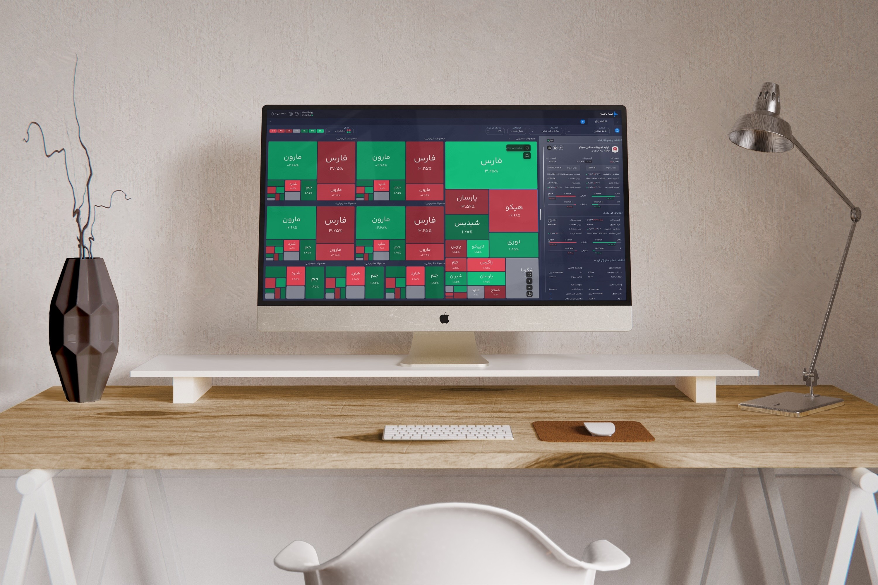
Professional Trading Dashboard for Iranian Stock Symbols

A central registration system

After completing the design system and delivering full documentation to the development team, our next critical focus was integrating the system into both internal and external products. This phase was essential—not only to prove the system’s real-world usability, but also to foster strong cross-functional collaboration between design and engineering.
We didn’t see the design system as a one-time delivery. To truly make it valuable, we treated it as a living product—something that evolves with user needs, product changes, and new use cases. That meant putting systems in place to continuously maintain, update, and expand it over time.
By defining clear principles and contribution guidelines, we empowered the team to keep the system aligned with real usage and feedback, while ensuring consistency across all products.
Key Principles for Maintaining a Living System
• Ongoing Updates: The system is regularly updated based on new requirements and user feedback.
• Component Governance: Every new addition or modification follows a clear review and approval process.
• Cross-team Collaboration: Open communication between designers and developers to flag issues and propose enhancements.
• Single Source of Truth: Figma and documentation are kept in sync and serve as the foundation for all future work.
• Scalability: The system is flexible enough to support both current and future product needs without fragmentation.
This project gave me a deep, practical understanding of the real value a design system brings to digital product development. It showed me that when companies are willing to invest both time and resources into building a system like this, the payoff is much greater than just visual consistency.
A well-built design system becomes a scalable foundation—one that empowers product teams to move faster and more confidently, even as team members or priorities change. It reduces dependencies and makes it possible for teams to continue shipping high-quality work without needing constant design oversight.
One of the most important takeaways for me was seeing how much more focused and efficient both design and development teams became. Designers had more time to concentrate on UX and problem-solving, while developers could build faster thanks to a ready-to-use component library. More importantly, they had time to improve product performance instead of rewriting UI from scratch.
This project helped me see a design system not just as a toolkit, but as a shared language—one that connects teams, drives consistency, and lays the foundation for future growth.
This case study is about designing the rating system during the redesign of Okala’s product, which helped improve the overall user experience.
This case study explores how a strategic redesign of Hamshahri’s platform enhanced user experience and successfully brought the platform back into the competitive market.