How the Okala Redesign Boosted Sales and Improved User Experience
This case study shares the story behind the redesign of Okala — one of Iran’s leading FMCG platforms with over one million daily active users.

About Okala
Outcome
Redesigning the Okala product was a high-risk project, but one we knew was crucial — because it directly impacted both performance and user experience. By focusing on user pain points and optimizing key interaction flows in the first phase, we saw a noticeable improvement in conversion rates and successfully attracted a younger generation of users. Sales also grew significantly as a result.
According to the company’s annual report :
• The number of daily active users reached 710,000 just five months after the new design launched
• Daily orders climbed to 156,000, surpassing our closest competitor
• Customer satisfaction with the product rose to 81%, which was a major and welcome achievement
My Role
In July 2023, I worked as a Senior Product Designer to improve Okala’s user experience. I collaborated with the research team to gather data and analyze user behavior, focusing on user-centered design for the product redesign. I helped design research methods, analyze data, and worked with the design team to implement insights, address pain points, and update the product based on user needs and market trends.
Imagine, After years of strong marketing, we built a large and loyal customer base. But with growth came new challenges — users were dropping off mid-purchase, struggling to complete orders, and unsure how to get help.
These issues caused frustration and hurt both trust and performance. To fix this, we launched a three-phase redesign focused on easing user pain points and improving the overall experience.

For a project of this scale, we needed a well-structured planning phase and a clear roadmap to execute each phase efficiently — delivering high quality in the shortest time possible. We had to dig deep to uncover real user pain points, gather meaningful feedback, and run multiple usability tests to build a reliable foundation of insights.
This redesign wasn’t just another project for Okala. It was a critical move — user engagement was steadily declining, costs were rising, and competitors were quickly taking over the market.
Our approach had to be bold and fast. We identified redundant components, mapped out areas where users got confused, and reimagined the core experience. The goal wasn’t just to fix existing problems but to create a product that could attract new users and stand strong against market competitors.
Okala had established a strong market presence, but rapid growth brought usability issues that impacted conversion and order completion rates. As the user base aged, younger users shifted toward competitors with more modern, intuitive designs. This signaled the need for a full product redesign—not just a visual update. The goal was to fix core flows, resolve structural issues, and deliver a smoother experience. The product’s foundation wasn’t built for scale, and growth had only amplified these flaws. A redesign was essential to support future growth and user needs.
Risk and Challenges
• Live System Impact: Redesigning a product with over 4 million users risked disrupting the live experience, potentially affecting trust and sales.
• User Habit Disruption: Major design changes could confuse existing users who were familiar with the current flow, leading to frustration or churn.
• Tech Compatibility: Ensuring the new design aligned with existing infrastructure was critical to prevent performance or integration issues.
• Fast Execution: Designing and implementing the new experience quickly, while maintaining usability and cross-team alignment.
• Dual Audience Focus: Creating a product that appeals to new users without alienating the current user base.
• Scalability & Sustainability: Delivering a future-proof design system under tight deadlines that could evolve with product growth.
Enhance User Experience (UX) with Modern Design
Increase User Engagement and Retention
Ensure Scalability and Future-Proof Design
Seamless Integration with Existing Technology
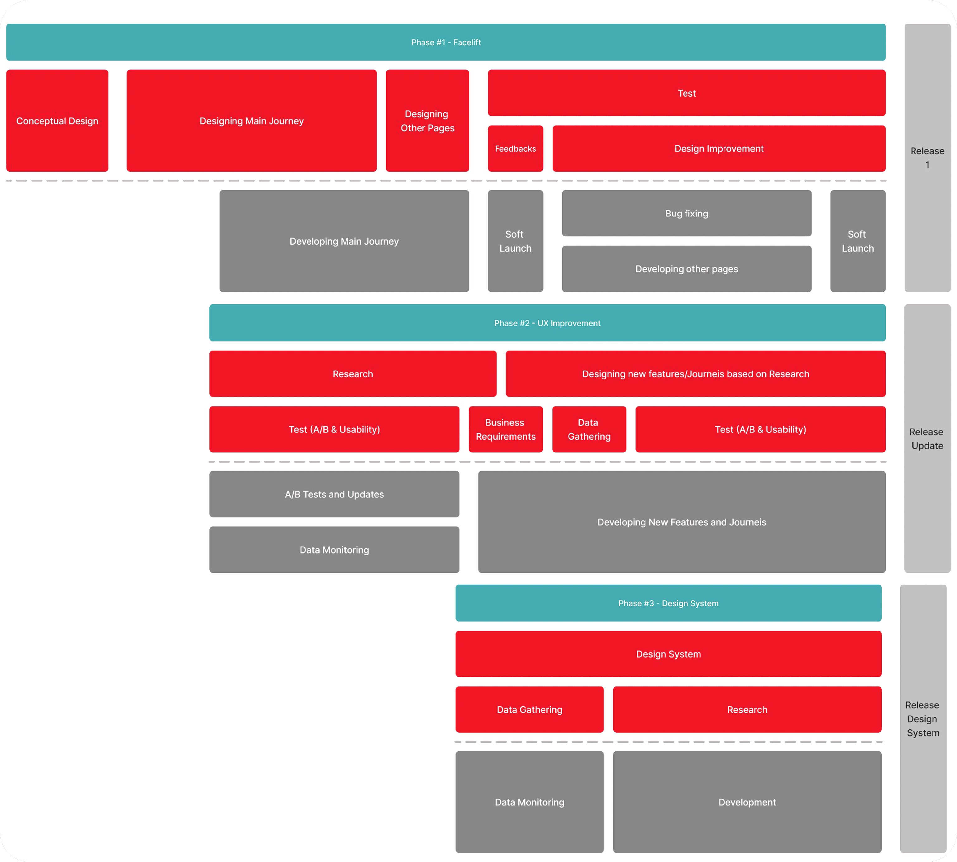
Planning
Phase 1 : FaceLift
Phase 2 : Ux improvement
Phase 3 : Design System
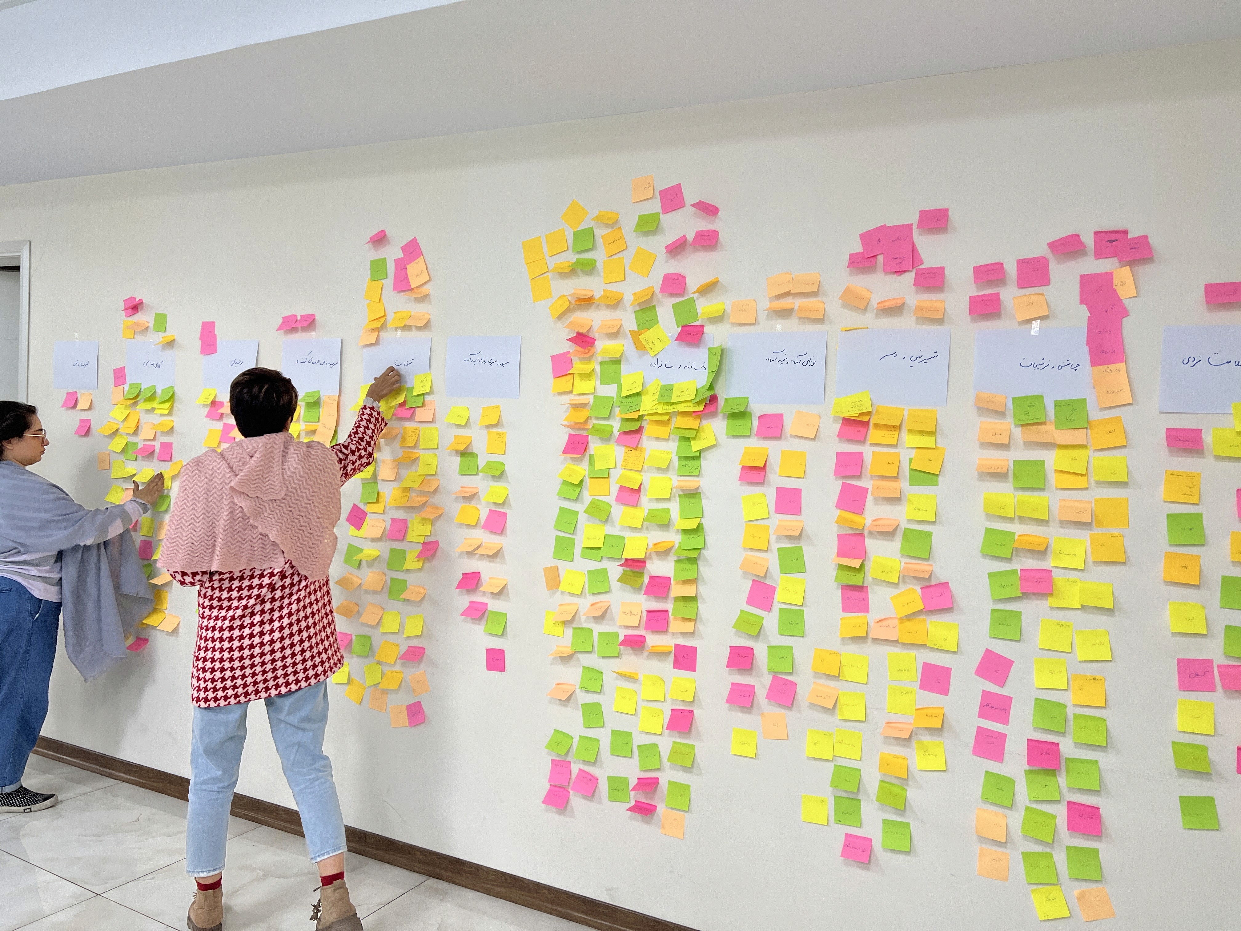
To truly understand user pain points and identify where users struggled the most in their journey, we didn’t rely solely on internal quantitative data. Instead, we used a mix of research methods to gather insights directly from users. This approach helped us pinpoint exactly which parts of the experience were causing the most friction, while also allowing us to compare user feedback with our existing data — helping validate the issues and prioritize them more effectively.
Another goal was to identify the average age of our users and understand their shopping patterns. These insights helped us in prioritizing elements and informed our design decisions.
Research Methods
• A questionnaire sent to over 11,000 users
• Usability testing with 36 participants, including both internal team members (non-designers) and external users
• Analysis of existing internal quantitative data
Key Research Insights
• Address selection issues: Out of 21 users interviewed and tested, 13 either forgot to select an address or chose it incorrectly, leading to confusion and delays in the checkout process.
• Store awareness gap: From the questionnaire and interviews, we discovered that only 38% of users selected a store before shopping. Most users were unaware that their cart might include items from multiple stores.
• Add-to-cart behavior: Among 15 usability test participants, 9 prioritized using the search bar, while others used the carousel. None used the category section, likely due to its low visibility on the homepage.
• Cart interaction issues: Users faced problems when adding items, dealing with out-of-stock items, or removing products. These issues led to 34% of users abandoning or completely clearing their cart.
• Delivery time slot & store capacity confusion: For 38% of users, the store’s capacity and delivery time windows weren’t clearly communicated, often resulting in cart deletion or abandonment.
• Payment step difficulties: Many users struggled to find the discount code field, often having to navigate back to their profile to locate it — making the payment flow unnecessarily complex.
• Payment method confusion: Online, installment, and credit-based payment options were too complicated, causing frustration for many users.
• Post-order tracking: Users found order tracking unclear, which often led them to contact customer support for updates.
And these are just some of the main issues we uncovered.
Through these methods, we were also able to identify our users’ average age range and better understand their shopping behavior patterns, thanks to carefully designed survey questions and structured analysis.
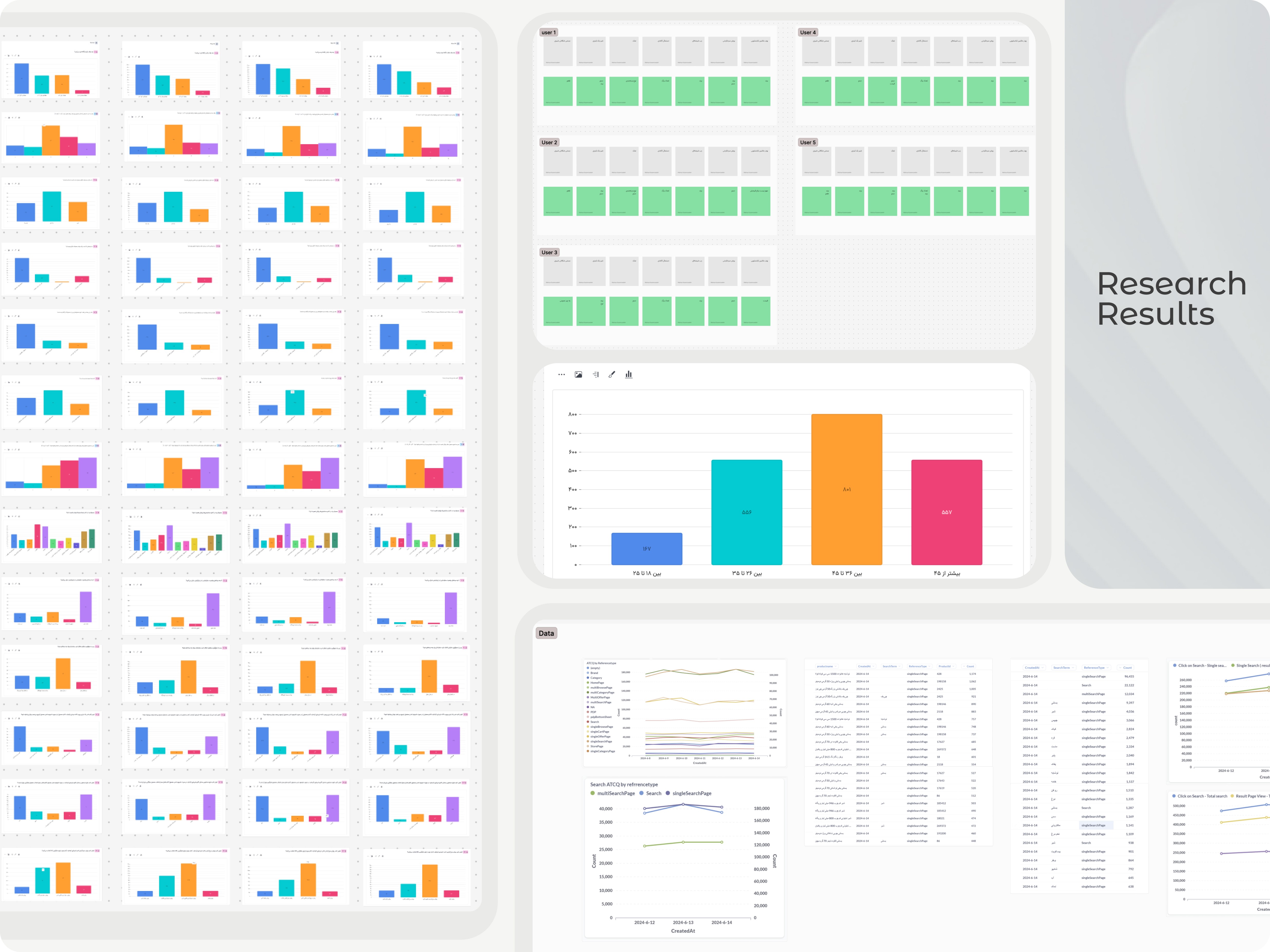
All of these insights represent a condensed summary of the data and findings that I, along with the research team, gathered through various methods.
To design a practical solution tailored to our users’ needs, we first needed to conduct a competitive benchmark — both locally and internationally — to understand how others were solving similar problems. Local competitors gave us a more relevant point of reference, as they operate within the same culture and user behavior patterns. However, we also analyzed several international players using Mobbin. This helped us identify useful UI patterns for the redesign and gather inspiration for solving our specific pain points.
We carried out the benchmarking based on our priorities and the user flow we had in mind, carefully analyzing each step of the journey in detail. We documented key observations that could later support our redesign decisions. Many of these findings also became valuable discussion points in our brainstorming sessions, where we extracted actionable insights to inform our design direction.
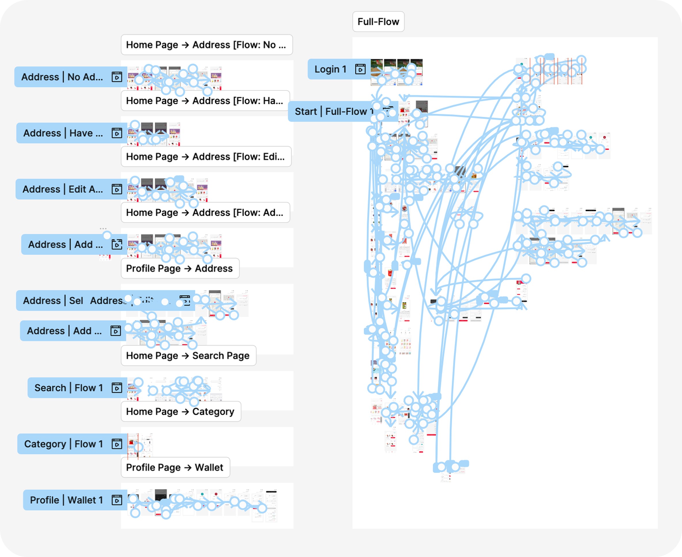
Sitemap
To better understand the user journey and identify confusing or unnecessary steps, we created a detailed sitemap covering all key flows. This step was critical for us, especially after our research revealed that many users were abandoning their flow midway and going back to previous steps. We needed to carefully track and analyze these patterns across all journeys. One of the most significant examples was during the payment process — many users were navigating all the way back to their profile page just to find their discount code, interrupting the flow and increasing the risk of drop-off.

To deliver a modern and efficient design for Okala’s users, we started by leveraging the insights we gained from our benchmarking. Drawing inspiration from component structures, the use of white space, element simplification, and other key ideas, we used the parallel design method. Each designer on our team was tasked with independently redesigning the homepage — one of the most strategic pages, as it would help shape the overall direction of the redesign.
In these initial concepts, we incorporated everything we had learned from research — including component prioritization based on user shopping behaviors and product cards designed for easier access to basket actions and etc.
After several team sessions, usability tests, and collaborative evaluations, we eventually locked down the final design structure in Figma. My proposed direction was selected, as it effectively addressed the key user needs we had identified.
With the design strategy now clearly defined and supported by rich user data, we moved on to designing the components and pages — all guided by the documentation and insights gathered during our research phase.
Designing with data in mind significantly increases the chances of success, as it ensures the product is aligned with how the majority of users think and behave.
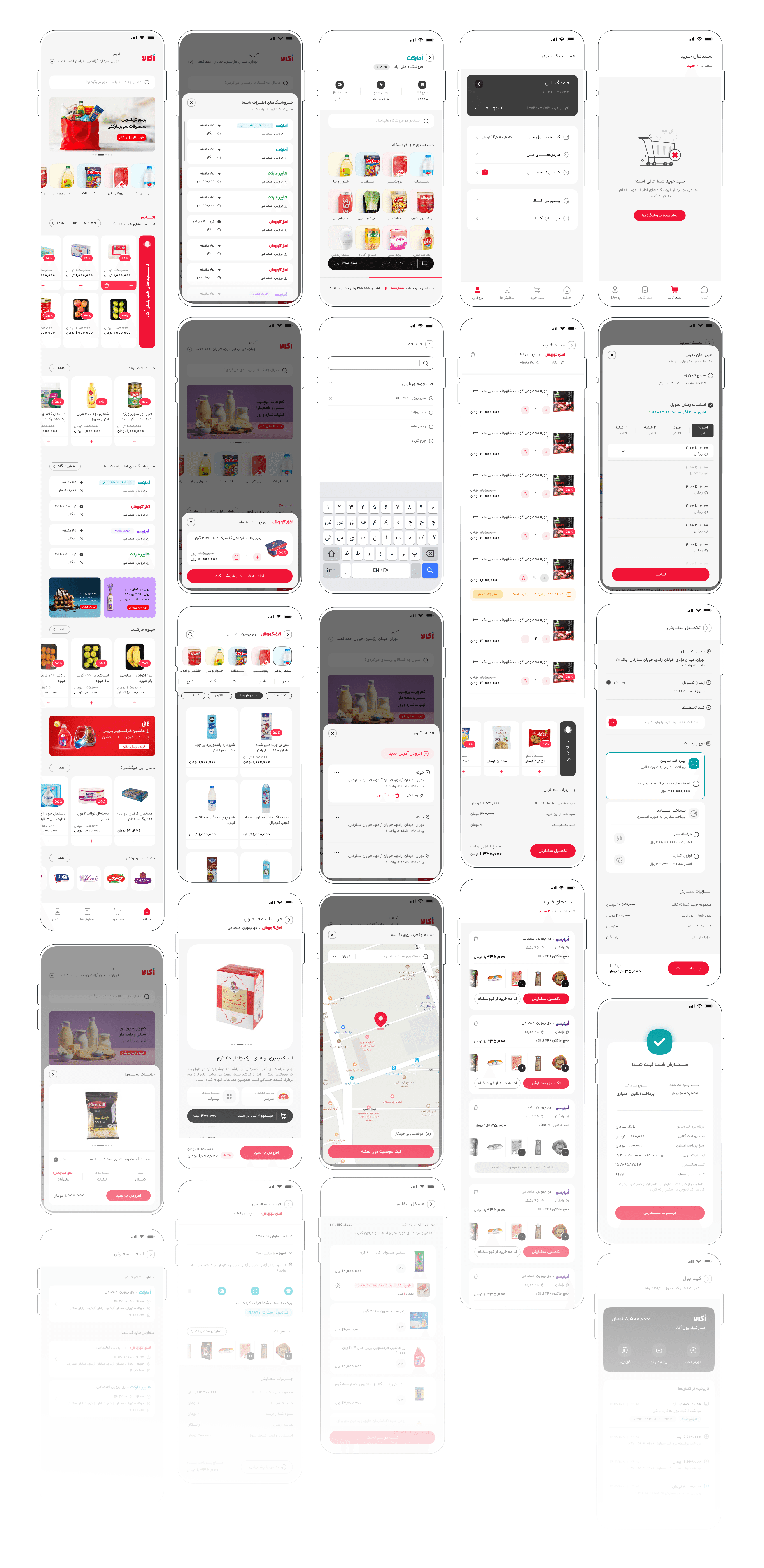
Solutions and Finalizing the Design
Here, I’ll just present a few examples of the designs and changes we made — briefly and to the point. All of these were iterated and refined through multiple rounds of testing to ensure they truly met user needs.
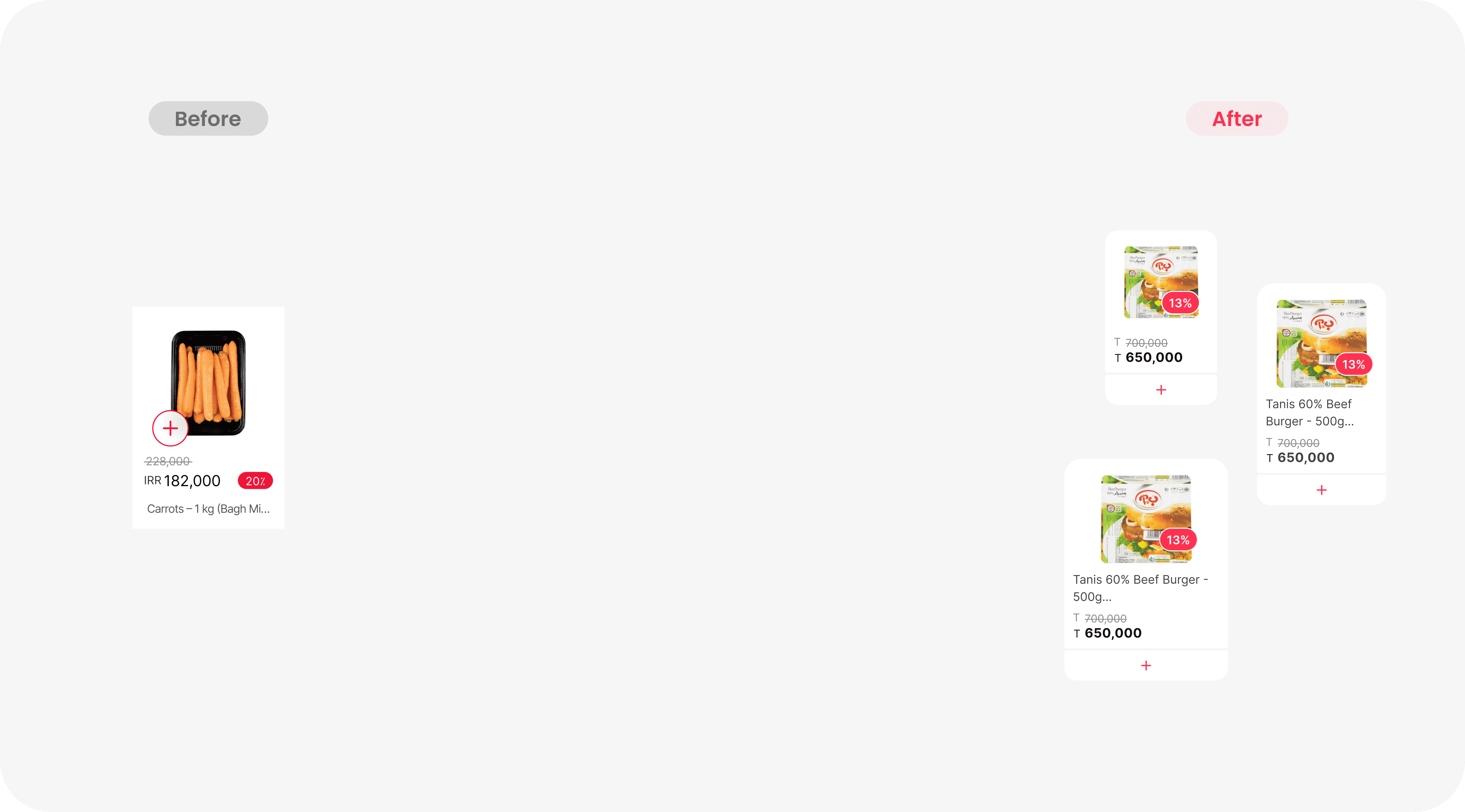
🛒 Add-to-Basket in Product Card
During our usability tests, we found that 9 out of 15 users struggled with the accessibility and visibility of the “Add to Basket” button across different pages. In many cases, the product image and initial details weren’t enough for users to make a purchase decision — they often had to open the product page to find the information they needed. This not only increased the time to complete a purchase but also led to drop-offs.
Since this component plays a key role in our product experience, we focused on several important improvements:
• Improved accessibility of the Add to Basket button across all views
• Clear spacing and layout, adaptable to the various contexts where the card appears
• Micro-interactions to enhance user feedback and experience
• Essential product info upfront to support faster and easier decision-making
• Dedicated space for promotions and discount badges, without overwhelming the layout

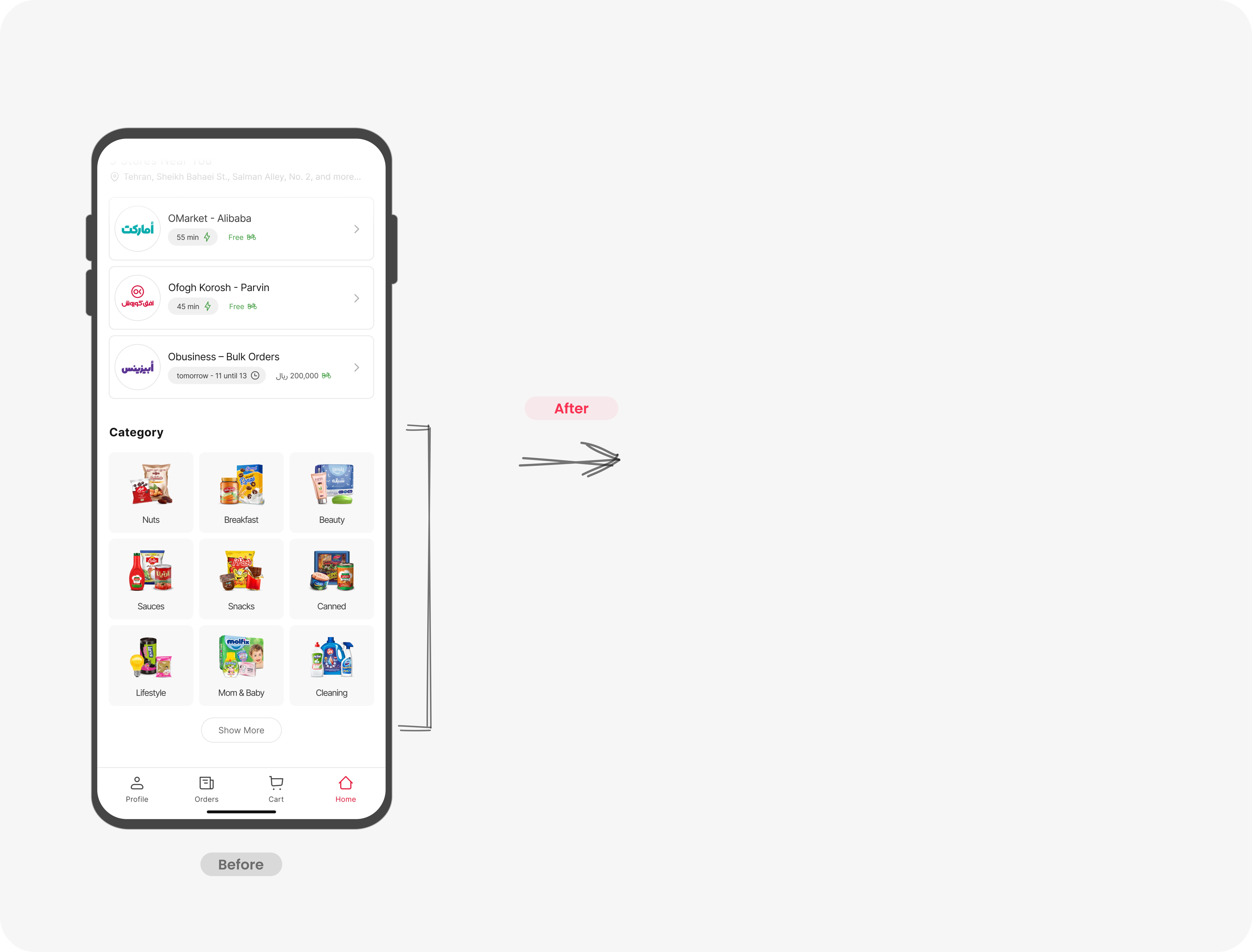
🗂️ Finding Products via Categories
In our usability tests, we found that only a small percentage of users relied on categories to find products — a result that wasn’t surprising. There were several issues in the existing category structure that contributed to this behavior:
• Too many steps: Reaching a product often required clicking through a main category and two or more subcategories
• Poor categorization: Products were often misclassified, leading to confusion and wrong decisions
• Low visibility: The category section was placed at the very bottom of the homepage, making it easy to overlook
As a result, users preferred faster alternatives like search or carousel browsing. This insight helped us rethink the category experience to make it more intuitive, visible, and useful for product discovery.
Improving Category Structure
Based on our user research and data analysis, we realized we could significantly improve product discovery through categories by introducing a two-level structure (X and X1). This approach allowed users to reach their desired products faster with fewer clicks.
To build a more intuitive categorization:
• We conducted research on our competitors’ taxonomy to understand how they organized similar products.
• We performed shadow research in large chain stores to observe how users naturally navigated and grouped products in real-world settings.
• For products that could logically fall into multiple categories, we ran a card sorting exercise to understand how users mentally organized these items.
To encourage more users to explore through categories, we also improved category placement and visibility — giving it a more strategic position on both the homepage and store pages. Our hypothesis was that with clearer structure and better placement, category navigation could become the second most-used path after search.
These efforts helped us create a smarter, more user-friendly category structure that better aligned with user expectations and behaviors — ultimately increasing the usefulness of the category navigation.
🛒 Improving Access to the Shopping Cart
User behavior during the shopping journey showed that many users abandoned their carts or removed all items before completing a purchase. Through usability testing, we discovered two main reasons for this:
1. Users encountered unavailable items in their cart and had difficulty removing or replacing them.
2. Users tried to optimize their order to qualify for Okala’s free shipping threshold, which required them to check the total amount repeatedly.
This led to a frustrating loop: users would constantly return to the cart in the middle of browsing to check if they had reached the minimum order value. This repetitive pattern disrupted the shopping flow and often resulted in cart abandonment.
Improving Cart Structure
After multiple usability tests, we realized we needed to make the cart more accessible and informative throughout the shopping process. Here’s what we did:
• We added a floating cart preview that was always accessible during shopping, showing the total amount and the remaining balance needed to qualify for free shipping.
• We introduced a clear and friendly message at the bottom of the screen that encouraged users to add more items to unlock free delivery.
• Inside the cart, we displayed out-of-stock items more clearly, allowing users to easily remove or replace them.
• We also added a product recommendation carousel beneath the cart—tailored to the user’s basket—to help them quickly find relevant items to complete their order.
These changes significantly improved the user experience by reducing the friction in the purchase journey and increasing the chances of completing a purchase.

Measuring Impact Through Iterative Testing
We followed a strategy of prototyping each main user flow once it was designed and ready, and then tested those flows as thoroughly as possible before moving on. Our primary goal during this phase was to observe how users responded to the redesigned interface—especially how it influenced their behavior patterns—and to assess whether our changes had a positive effect on key product metrics.
After completing the initial round of usability tests, we gathered user feedback and used those insights to make targeted redesign improvements. We then ran another round of testing to validate the changes.
Our team worked in an agile environment, which meant we focused on designing and testing one user flow at a time. Once a flow was finalized and validated, we moved on to the next one.
To track the impact of our work, we used a few key metrics to compare performance before and after redesign:
• Time on Task (ToT): How long it took users to complete each task.
• Task Completion Rate: Whether users were able to reach their goal without friction.
• Drop-off Rate: How many users abandoned the flow at different stages.
By continuously testing, learning, and iterating, we ensured that each redesign phase was data-informed and aligned closely with user needs.
َUser flow
We kicked off the Okala redesign rollout with a 10% traffic exposure strategy to carefully monitor user behavior and critical metrics. For the first three weeks, we focused entirely on analytics—using tools like Google Analytics and Microsoft Clarity—to capture deeper insights into how users were interacting with the new design.
We paid close attention to indicators like rage clicks, dead clicks, extensive scrolling, smart events, and the custom funnels we had set up. Every usability issue we uncovered was categorized into four main groups: Bugs, UX/UI Issues, Confusion, and Frustration. This helped us prioritize what needed immediate fixes versus what could wait.
We closely monitored user session recordings and heatmaps, aiming to gather the most relevant data before scaling the rollout. After validating the first 10%, we gradually expanded to 30%, 70%, and finally 100% of users.
Four months after the full launch, we reviewed post-launch metrics, survey results, and user feedback. Despite the challenges, the results were highly encouraging: user satisfaction increased significantly, and we even broke our daily sales record, outperforming competitors in a highly competitive market.
According to the company’s annual report :
• The number of daily active users reached 710,000 just five months after the new design launched
• Daily orders climbed to 156,000, surpassing our closest competitor
• Customer satisfaction with the product rose to 81%, which was a major and welcome achievement
In the next phase of the project, our focus will shift toward deeper layers of the product experience. We aim to enhance the core functionality through ongoing UX improvements and align our efforts more closely with business goals by collecting more targeted behavioral data.
We plan to introduce features and structures that not only support user needs but also create measurable value for the business—ensuring the product evolves into something more robust, useful, and cohesive. By closing this loop between user value and business impact, we’ll be one step closer to building a truly seamless and complete product experience.
We also plan to complete the design system aligned with the new redesign, including clear guidelines and documentation. This will help build a modern, scalable design foundation—especially important for a growing company like Okala—so the team can move forward with consistency and efficiency.
By introducing features that connect user needs with business objectives and supporting them with a strong design system, we’ll be able to ensure the product is not only functional and user-friendly but also strategically sustainable.
One of the most valuable lessons I learned during this project was the importance of teamwork and alignment. Having a team that shares the same vision and collaborates closely across functions creates the right environment for growth—not just for the product, but for every individual involved. I realized how much of an impact a supportive and aligned culture can have, especially in companies that are still growing and evolving.
Another key takeaway for me was the power of data-driven design. Throughout the project, using real data to guide decisions helped us stay focused on user needs and business goals. Designing with clear insights didn’t just improve the user experience—it significantly increased the success of the product. I experienced this firsthand at Okala, where the results of our redesign even surpassed our expectations.
Other Case Studies
This case study is about designing the rating system during the redesign of Okala’s product, which helped improve the overall user experience.
This case study explores how a strategic redesign of Hamshahri’s platform enhanced user experience and successfully brought the platform back into the competitive market.